Logo Design
Staar One
Case Study
Case Study

When I was asked to redesign the STAAR One logo, I was told to keep all text, colors and graphic elements. The client wanted an updated look, but didn't actually want to change anything. I had a serious talk with my client and reminded them (the board members) of the reason they contacted me. I spoke to them of my past experience, the work that I had done for them in the past and repeatedly asked them, "Why do you want to change this logo?" Their answer was always the same, "It's old, it's outdated and it was just thrown together."
Graphic designers often forget two vital attributes they must possess: patience and salesmanship.
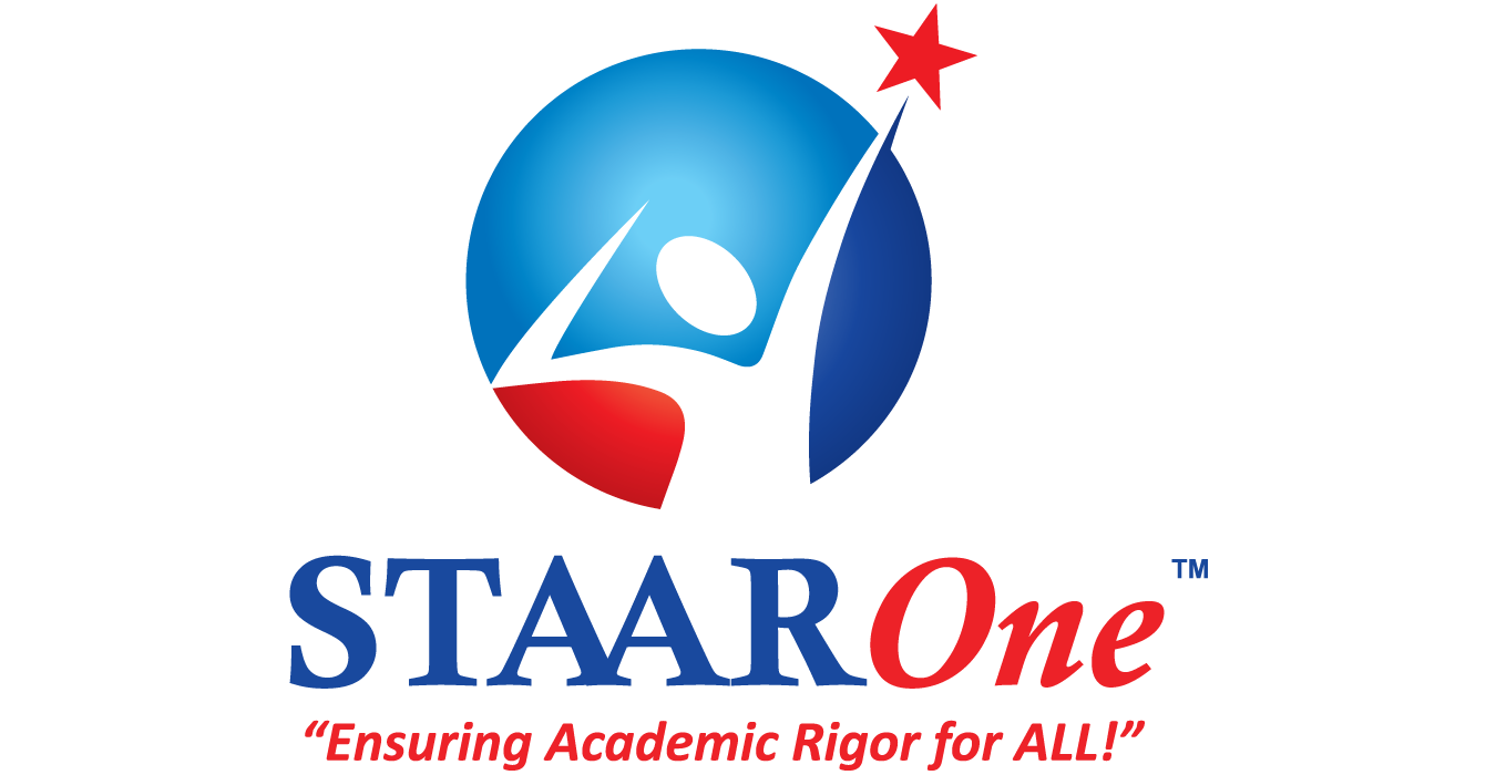
Above is my redesign of their logo.
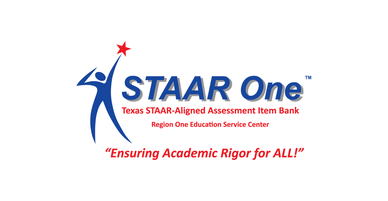
Just as the client had stated, the original logo was never "designed" it was just "thrown together."
The styalized human figure was hand drawn many years before I undertook this project. It had become an icon used in many aspects throughout the organization. Obviously, the name had to be kept, and although the client wanted to keep all the text, I convinced them to only keep their slogan.
The greatest challenges of the redesign process was convincing the client that I had their best interests in mind. Each one of my concepts and revisions was met with doubt and hesitation. And each time I reminded them of why they hired me.

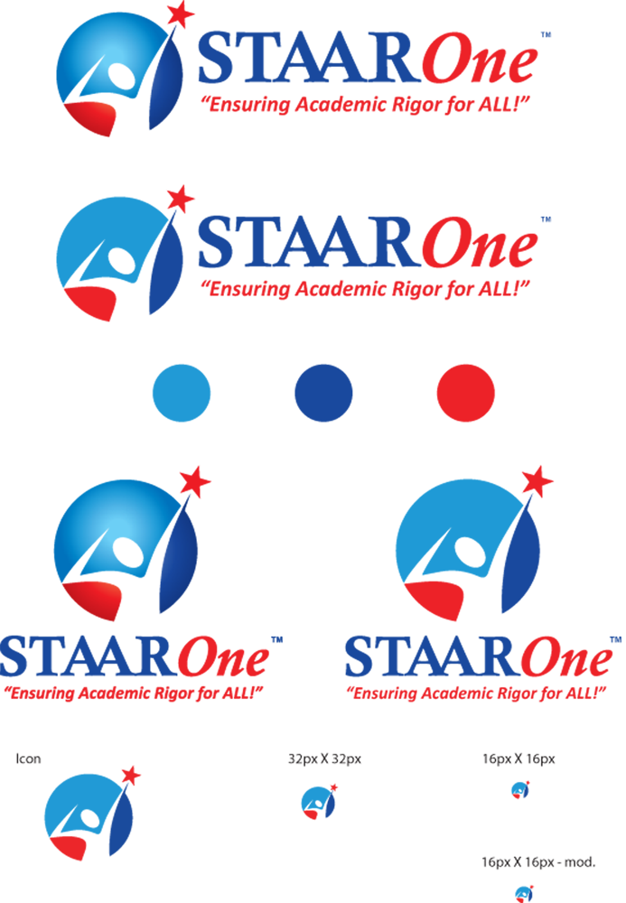
In the end, I was able to give them a much bolder, powerful logo design. I accomplished this by adding a third color to the design and eliminating the drop shadow. I also changed the brand's type style to compliment the main image. The biggest challenge was convincing the client to alow me to alter the human figure and use it's shape as a negative in the three colored circle. I hardly touched the slogan, which helped the client keep some familiarity with the original version. Below you can see some of the elements and variations that accompany my redesign.
